Light
When colour disappears
Black and white does not take less from a botanical image. It brings something else forward: form, surface, shadow and the way light remains on a flower.
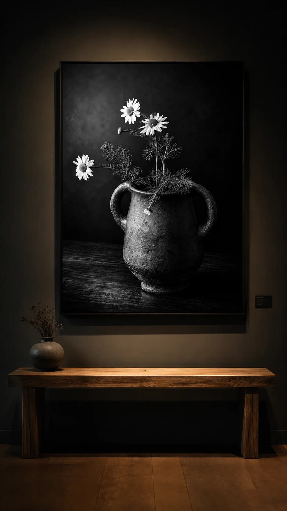
Colour is often the first thing someone sees in a flower. Red moves forward. Yellow catches light. Purple can give an image an almost velvet quality. But when colour disappears, something remains that is slower and perhaps more honest: the direction of a stem, the veins in a leaf, the edge of a flower still holding a little light.
That is why black-and-white botanical fine art photography interests me. Not as a nostalgic effect, but as a way of looking again. A flower no longer has to persuade through colour. It has to speak through posture, surface, shadow and space.
Colour can also distract
In my dark colour works, colour matters. It gives warmth, direction and sometimes almost an inner glow. Still, colour can remain the first layer. Someone sees red, yellow or purple and feels satisfied before the image has truly been looked at.
With black and white, that happens less quickly. The eye does not search for a match with a sofa, a vase or an accent colour in the room. The eye has to slow down. Where does the light fall? Where does an edge soften? Which form remains when all colour information is removed?
“When colour disappears, the flower has to carry itself through form, light and presence.”
That does not make black and white more neutral. It makes the image stricter. Everything that does not hold becomes visible sooner.
Texture becomes more important
A petal is rarely smooth when you keep looking. There are veins, folds, small marks, thin edges and places where light almost wants to pass through the leaf. In colour, those details can sometimes disappear behind saturation. In black and white, they become part of the subject.
The surroundings also gain weight. A vase, a wooden table, a dark background or a quiet wall are not merely decor. They determine how the eye moves. Black and white asks for attention to material, not only in the artwork itself, but also in the room around it.
That is why a black-and-white botanical image often works well in interiors where material is already present: wood, natural stone, linen, lime paint, steel or ceramics. The image does not add another colour voice, but it does add surface and depth.
Calm without emptiness
A black-and-white work can bring calm, but calm does not mean that nothing happens. In a good monochrome image, there is still tension in the composition. A light flower against a dark field. A stem that is not entirely straight. A vase that feels heavy beside a fragile bloom.
For an interior, that tension matters. An image without colour must not become flat. It needs enough graphic strength to remain legible from a distance and enough detail to reward looking up close. Otherwise black and white becomes only absence.
That is why I do not look only at contrast, but at breathing room. The dark parts must be truly quiet. The light parts must not shout. Between those two, the image appears.
What black and white does to a room
In a room, black and white behaves differently from colour. It seeks attention less quickly, yet it can organise the room. A large black-and-white botanical work can make a wall calmer because the contrast gives structure without introducing a new colour palette.
That is especially valuable in spaces where much is already happening: a dining room with wood and stone, an entrance with changing daylight, an office where concentration matters, or a wellness space where the image should not become decorative. Black and white can give such places a quiet spine.
At the same time, it asks for careful placement. A corner that is too dark can close the work down. Light that is too hard can add reflection or sharpness that does not suit the softness of the form. Wall, light and viewing distance therefore remain part of the decision.
No less botanical
Sometimes black and white seems further removed from the flower, as if colour is needed for a botanical image to remain botanical. I experience it differently. Without colour, it becomes visible how physical a flower is: how a leaf bends, how a stem carries weight, how a flower head turns toward or away from the light.
A black-and-white botanical image can therefore become less illustrative and more sculptural. The flower is not recognised because it is yellow or red, but because its form does something. It almost becomes a sign in the room, while remaining organic.
For me, that is the reason to keep exploring this subject. Not as a replacement for colour, but as another way of asking the same question: when does a flower become more than decoration?