Collecting
How do you choose fine art photography for an interior?
Art for an interior should not merely fit. A well-chosen work keeps calling you back as you pass it, as the light changes and as the room becomes quiet.
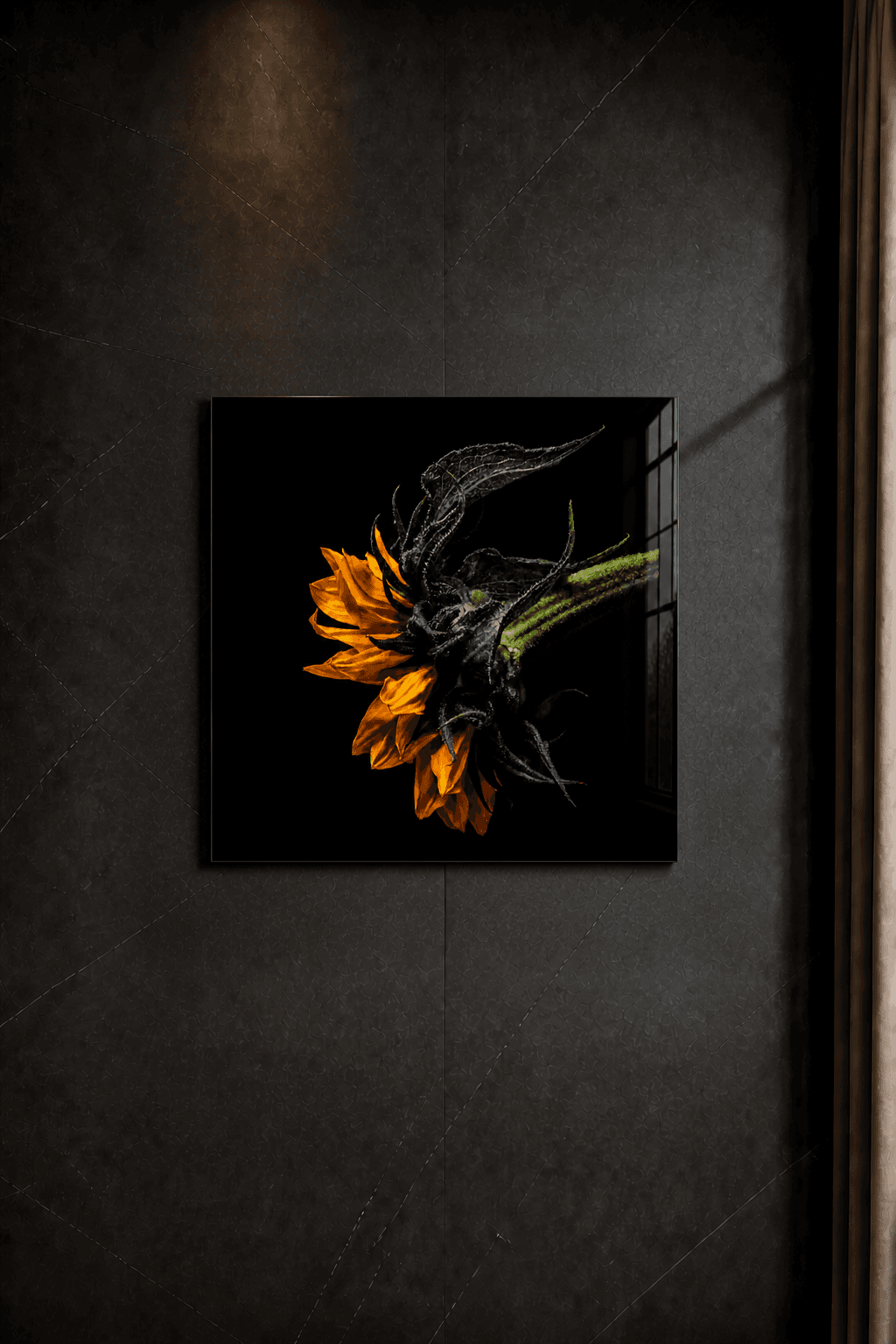
Fine art photography for interiors does not start with the image, but with the room. Wall width, viewing distance, natural light, wall colour and the function of the place determine which work truly fits. Only then comes the question of which image moves you.
At Beate Marie Photography, the work is botanical fine art photography in limited editions. The flower is not a decorative motif, but a presence in the room. That is why size, material, edition and placement matter as much as colour or subject.
A flower can remain quiet and still be present
The layering of a flower does not need to be presented loudly. When image, material and space reinforce one another, a quiet presence emerges — one that lets the room breathe.
1. Start with viewing distance and scale
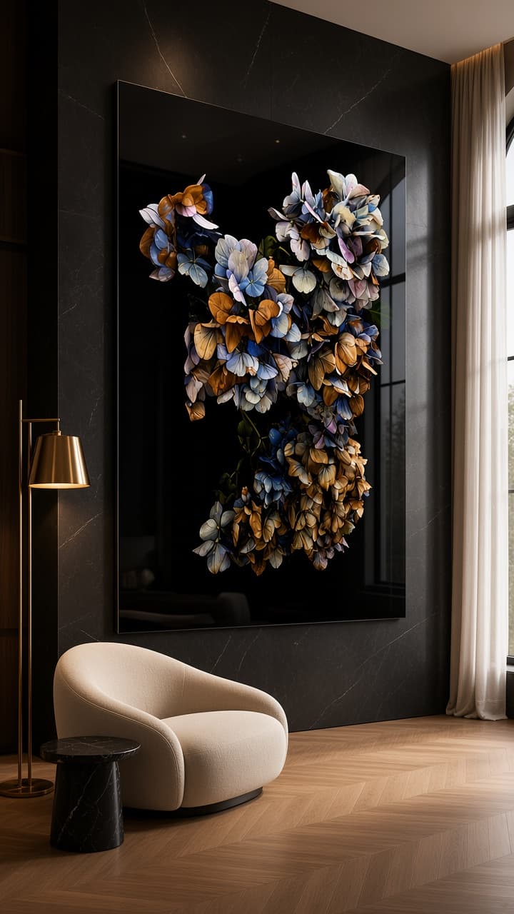
A work of 80 x 80 cm behaves differently from a work of 100 x 130 cm. Not only because it is larger, but because it changes the relationship with the viewer. In a hallway, a work is often seen in motion. In a living room, you look while seated, from an angle or up close. In an office or boutique hotel, the image also needs to remain legible from a distance.
So measure not only the wall, but also the distance at which someone first sees the work. A narrow wall does not automatically require a small piece. Sometimes a quiet large work has more breathing room than several smaller images. With dark botanical photography, a larger format can strengthen the stillness because there is enough space for shadow around the flower.
Do not use scale as decorative filling. A work should not simply fill a room; it should give the room concentration.
2. Choose tension, not only colour
Many interior choices start with colour repetition: something gold near brass, something red near an accent fabric, something dark near a black kitchen. This can help, but it is rarely enough. A work remains interesting for longer when it does not merely match, but adds a subtle tension.
A dark botanical print can deepen a light room. A red amaryllis can make a professional space more human. A restrained sunflower can hold a quiet reading corner without becoming literally cheerful. So do not ask only: does this match the sofa? Ask also: what does this work do to the room when nobody is looking at it?
For me, this is the core of fine art photography in interiors. The image should not shout for attention, but it must remain present.
3. Let material take part in the decision
Material determines how an image lives in a room. A loose print, a matte print, a glossy panel and a finished Diasec® object do not have the same presence. The current works are made as fine art prints behind Diasec® acrylic glass, with dibond backing and a certificate. Framing is available only on request.
This construction makes the work more physical. The acrylic glass strengthens clarity and depth; the backing gives stability. Especially with dark photography, this matters. Shadow must remain deep without becoming dead, and light details need to keep enough precision.
In an interior, this means material should not be chosen at the very end. Material is part of whether the work suits natural light, movement through the room, wall colour and everyday use of the space.
4. Read edition and availability as part of the choice
A limited edition is not a sales trick. It is a promise about how many examples of that work exist. This makes the choice more personal. You are not only buying an image that fits a wall, but a numbered artwork with a defined edition.
For an interior project, that information can be practical. A work in an edition of 5/5 may suit a private home or quiet hospitality space. A work of 3/3 carries another degree of scarcity. A unique work, such as Phoenix, always requires personal alignment.
When choosing fine art photography for a representative space, availability therefore belongs early in the conversation. Not to create pressure, but to understand honestly which possibilities are truly open.
5. Make the choice concrete in the room
A good choice becomes concrete when you place three things next to one another: the work, the wall and the use of the room. Where does daylight fall? Does someone pause or pass by? Is the room meant for receiving, rest, concentration or conversation? A flower that feels intimate in a dining room may become too small in a tall entrance.
That is why it is important to consider size, wall and viewing distance together. Dimensions and finishes are listed for every available artwork, so you can compare them calmly.
The best choice eventually feels self-evident, but it rarely comes from a search term alone. It comes from looking, measuring, comparing and deciding calmly.