Collecting
What does a limited edition really mean?
A small number beside an artwork can matter, but it never tells the whole story. The meaning of an edition lies in the commitments upheld by the artist, the provenance that remains traceable and the work itself that you want to keep looking at.
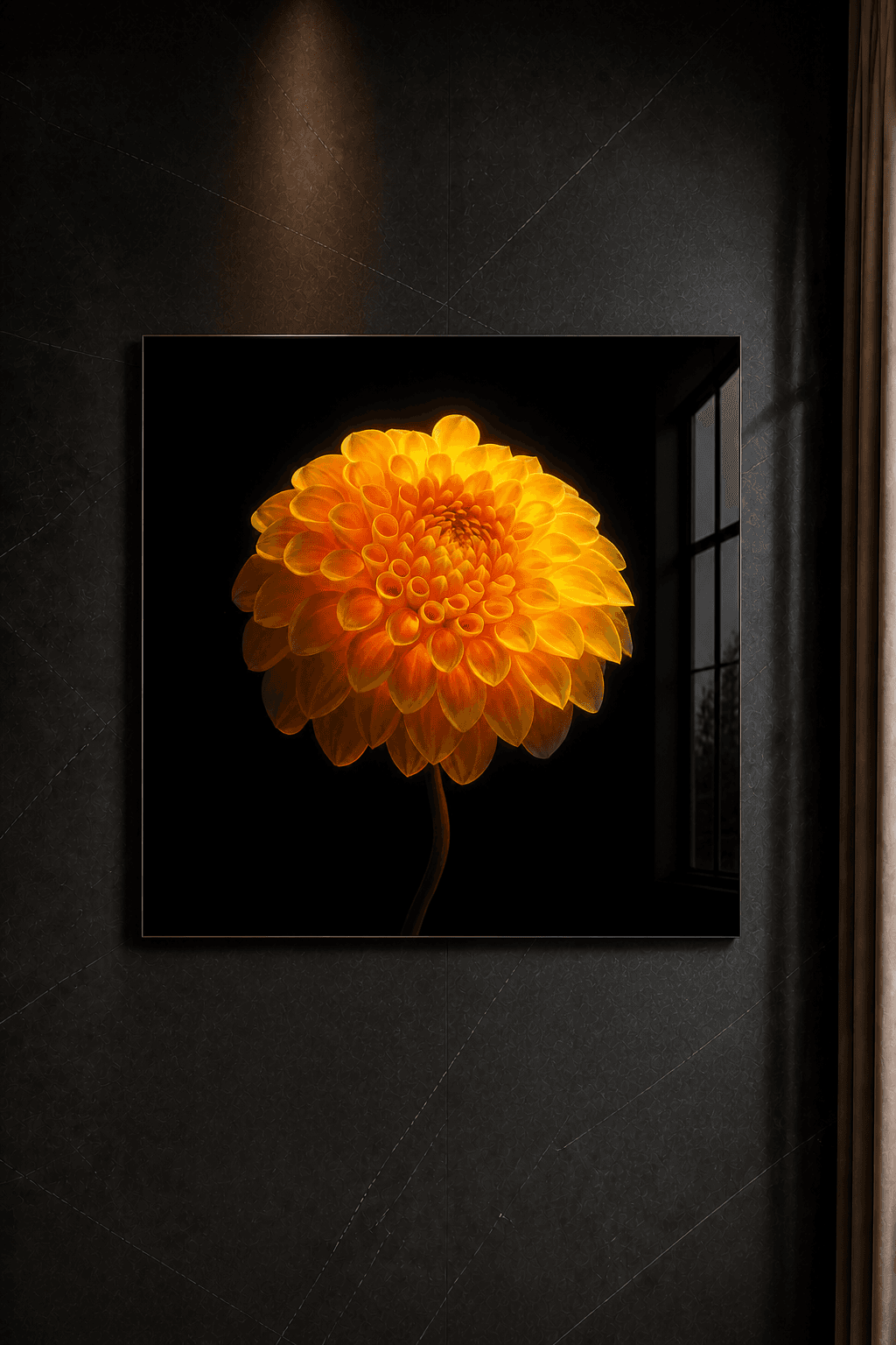
Anyone beginning to collect fine art photography will often encounter two numbers: 1/3, 2/5 or 4/8, for example. The second number states the size of the edition. The first indicates the place of an individual print within it. That seems simple, yet its real meaning begins with the question of what the artist is promising through that limit.
A limited edition is neither an ornament in the description nor a guarantee that an artwork will rise in value. It is first and foremost a form of discipline. The artist decides in advance how many examples of a work will be available in the stated presentation, and treats that boundary as an enduring commitment to the people who collect it.
A boundary that matters before the sale
Scarcity is credible only when it is not invented afterwards. An edition acquires meaning because its size is clear before the series is released. Within Beate Marie’s collection, that size is stated for each work: from Phoenix as a unique piece to editions of three, five or eight. A viewer can therefore see whether an image will exist once or as part of a small, defined series.
Smaller is not automatically better. An edition of one has a different intimacy from an edition of eight, yet the number says nothing about the quality of the composition, light or finish. A strong work remains strong because of what happens within the image. The edition adds a clear commitment; it does not need to make the image appear more important than it is.
For that reason, I prefer not to begin by asking which number is the rarest. I begin with the work that slows your attention. Only then does the edition become relevant: as context for how the work exists, not as a reason to manufacture feelings around it.
What numbering does and does not tell you
A number connects an individual example to the defined series. It helps identify the work and supports its record of provenance. For a collector, that is practical: title, artist, presentation and edition can be kept together in a coherent way.
The first number in an edition is not inherently artistically superior to the last. When each example is produced to the same standard, 1/5 should not be sharper, deeper or more carefully made than 5/5. The sequence may invite an emotional preference, but it is not a ranking of quality.
“The edition does not make an artwork meaningful. It makes the commitment around it accountable.”
Nor does a number say much on its own when everything around it remains unclear. Without transparent information about artist, title, size, material and edition size, it is only a mark. Numbering gains value through its relationship with sound documentation and an artist who treats the edition consistently.
Provenance is the quiet memory of an artwork
Provenance is the trail connecting an artwork to its maker and history. With contemporary art, that trail begins simply: a clear description of the work, the artist, its presentation and the edition. As a work changes owner or place, it becomes important that this information does not become separated from it.
Good provenance is not spectacular. It consists of consistent records, careful correspondence and documentation kept with the work. This helps a future owner, adviser or heir understand what the object is and where it came from. For the first collector, that care begins at the moment of acquisition.
Public product information does not need to reveal every security detail. Authenticity documentation can be transferred personally and with care, while the website provides enough information to understand the edition and presentation. Transparency and restraint can exist together.
The presentation belongs to the decision
In photography, you are not choosing only an image file. You are choosing a physical object with a particular size, material and character in the light. A botanical photograph behind Diasec® acrylic glass responds differently to a room than a work on paper. The depth of the dark image, the clarity of detail and its presence on the wall are shaped in part by the presentation.
Always read the edition together with the specifications. Ask which size is offered, how the work is finished and whether framing is part of the stated presentation. At Beate Marie, Diasec® is the consistent material basis and framing is available only on request. That clarity prevents a single edition number from being applied to objects whose presentations are barely comparable.
Placement deserves attention as well. A work measuring one hundred and thirty centimetres high asks for a different viewing distance and has a different spatial effect from an eighty-centimetre square. Choosing an edition begins with the image, but becomes complete only when material, scale, wall and light enter into conversation.
Five questions for a considered choice
You do not need to be a specialist to collect with care. A few concrete questions quickly reveal whether the information around a work is sufficiently robust: what is the total edition size, which presentation belongs to that edition, how is the individual example identified, what documentation will you receive and who can answer questions about the work later?
The most important question is deliberately less technical: do you want to live with this image? Art does not exist only in a record. It catches morning light, changes with viewing distance and becomes part of daily movement through a room. A small edition can make that relationship more intimate, but it cannot choose it for you.
Take time to compare works, imagine a size within the room and ask questions before deciding. Choosing slowly is not indecision. It is a way of giving the image, the object and the commitment around it equal attention.